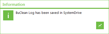
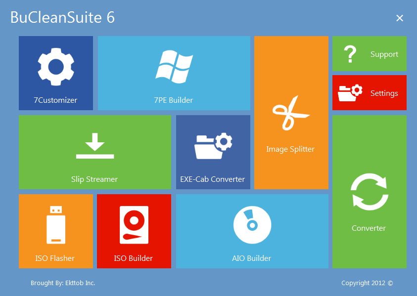
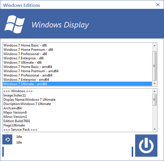
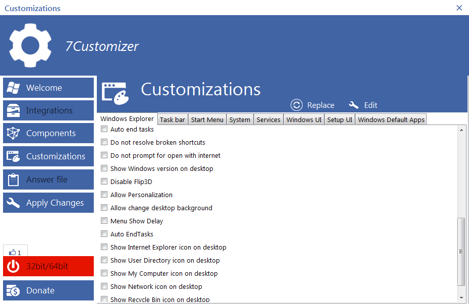
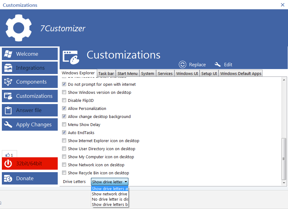
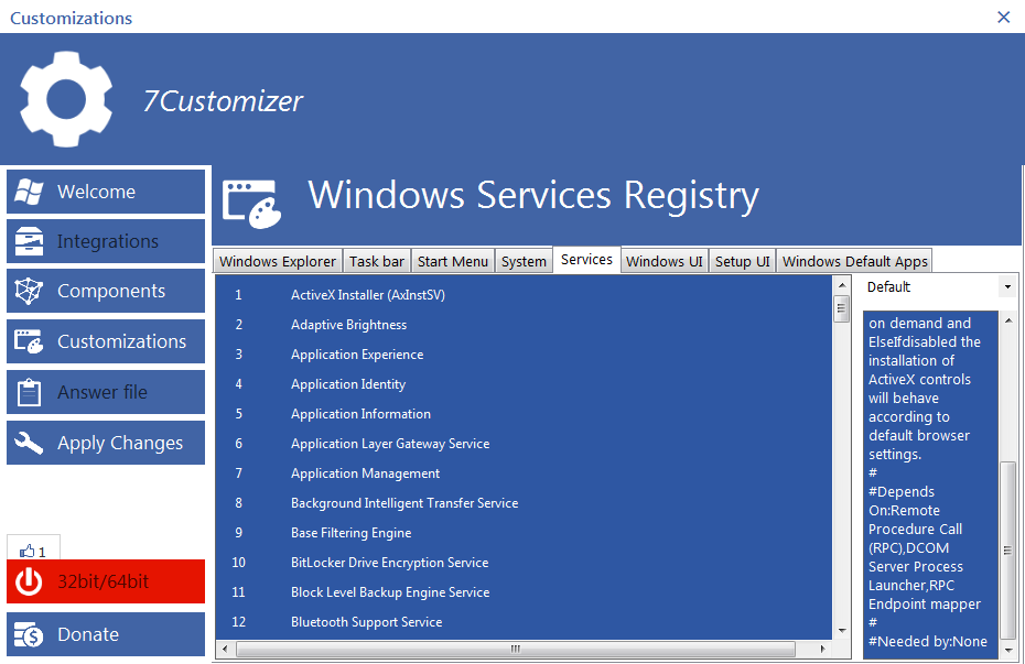
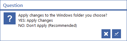
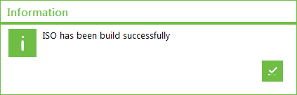
I just tried the program, and I have a few things to say about it. It seems that you like user input, so hopefully this will help in the development of the program! First of all, I really like the concept of the program (most importantly 7Customizer) as a kind of "RT7lite done right". And it does succeed in some ways, although a few things need a bit of polish. The user interface style, compared to the unordered mess of RT7lite, is a huge step forward by itself. Now I am not a big fan of Metro, but one thing is for sure, it makes the whole application look uniform and its elements don't clash together. It's also a step up from the original interface shown in the first page (you might want to update that, by the way!). I also like how there are no annoyances in the UI, once again compared to RT7lite and its advertisements. That said, there is one major issue with the interface, and it's the message text. Most of the dialog boxes that are displayed do not contain sensible information, or have spelling mistakes, making it really difficult to use (as well as lowering the overall image of the program - correct spelling is surprisingly important in that regard, and another thing that RT7lite was notorious with). I'll try and find some messages that I found unclear and attach them. Another issue with the interface is that it sometimes is counter-intuitive. For instance, if you hover the mouse over any element of the interface, even if it's purely decorative, its background lights up as if it was a button. That makes it hard to tell what is and what isn't a button. Also, some icons used are not fitting, like the turn off icon for "Next". What is more, there is an issue with some of the windows, like the one where you select the Windows 7 source, where the window is treated as always on top. No windows should ever be always on top by default, and in the case of that particular window, when selecting a DVD, the dialog box that appears asking if you want to copy its contents is sometimes hidden by the main window, making it appear frozen. Moreover, in the customisation step, some of the choices are very strangely worded and it seems that there are duplicates. Also, everything is deselected by default, even though I believe that some of the options by default are enabled. Lastly, after the customisation is complete, the "ISO it" button opens another extremely counter-intuitive interface. You can only press "Choose Windows" there, but what am I supposed to choose? The original DVD? The place where it was extracted? An empty folder? It would be nice if it was already chosen - it is obvious that I want to turn what I just finished customising into an ISO, not anything else. I'm not certain about the functionality of the tool just yet, still need to run a few tests. I did notice that the "Components" step has a lot of empty tabs, but then the DVD I'm using is not very clean (it didn't even copy the files when I tried to do that manually on Windows...), so it could be an issue on my end. Also, in the readme, I noticed that you are considering making it open-source. As a developer and a long-time Linux user, I believe that you should indeed make the program open-source. The reason is very simple - you do not lose anything, but your code can live forever. Even when you are no longer interested in updating the software, if it is open-source and someone is interested and capable of updating it themselves, they can do that. Otherwise, all your code would just go to waste. In addition, having the code open-source allows others to create patches for you - for instance, all of those spelling mistakes and vague messages could be improved very easily by pretty much anyone, and once the patch is sent to you, you can integrate it without any effort on your side whatsoever. Same thing with other bugs - essentially you get the chance of having bugs solved by the community itself. Finally, if the license that you select for your code is copyleft, then any modifications others make to your code have to be released to the public as well, which means that you will be able to integrate them into your own project if you like the changes, which essentially eliminates competition and makes everyone a contributor instead. That's all for now, I hope you find these notes useful. Comments about the attached images: 1: There is no indication about what "SystemDrive" is supposed to be. 2: Even though it's Metro influence, the main menu is counter-intuitive in that different size buttons are scattered about in no particular order. Grouping the buttons into categories would make it look a lot cleaner. 3: This message makes no sense whatsoever. There is no way to tell what either option is suposed to do. 4: The button that should mean "OK" uses the symbol for "Quit". 5: There are two "Auto end task" choices, and settings like "Show Recycle Bin icon on desktop" are supposed to be checked by default. The options "Menu Show Delay" and "Do not prompt for open with internet" are very vague. 6: The drop-down menu does not display the whole item name. 7: The window cannot be resized, and the description box cannot be resized as well, so the text there is difficult to read. Also, the word "Else" and symbols "#" should not be displayed there, and there should be spaces after the punctuation marks. 8: Again, it is unclear what the message box actually means. Also, the word "choose" is not used correctly. 9: Spelling mistake, it should be "built".